# Hugo Theme Development Diary
## Update (2025-01-05)
With so many AI-assisted programming tools available now, paired with IDEs like Cursor/Windsurf, developing a blog theme isn't difficult. Just clearly explain your requirements to Claude in Cursor, and you'll generally get good responses.
---
> Note: This blog uses the Hugo theme I developed. The following content isn't detailed, but developing your own theme isn't difficult with AI assistance nowadays.
> Hugo provides many built-in template variables that easily implement the basic features a blog should have. For detailed tutorials, check out YouTube and other platforms.
> Of course, you can also look at my GitHub source code to see how I built this personal blog system.
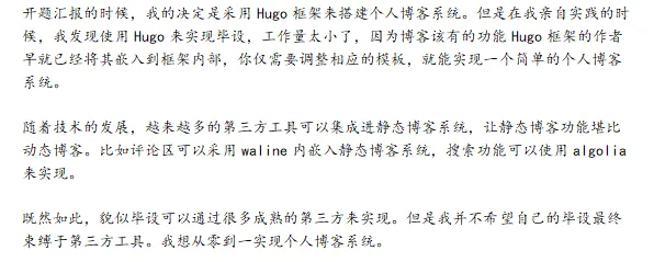
At the beginning of the month, when submitting my thesis mid-term report, I mentioned abandoning Hugo in favor of Next.js to complete my thesis. To better demonstrate Next.js's advantages over Hugo, I decided to develop a Hugo blog theme to explain during my thesis defense later.
From March 14 to March 16, over about two days, referencing multiple tutorials along with ChatGPT and New Bing, I finally developed my own Hugo blog theme. Here I'll record the Hugo blog theme development process.
Using the `hugo new theme hugo-simple-theme` command generates a folder named hugo-simple-theme in the themes folder.
The initial directory structure looks like this:
```
hugo-simple-theme (Hugo theme)
├── archetypes (Hugo theme article templates)
├── layouts (Hugo theme layout files)
├── static (Hugo theme static files)
├── LICENSE (Hugo theme license information)
└── themes.toml (Hugo theme metadata)
```
The key focus is the layouts folder. The remaining files can be added gradually.
The layouts folder directory structure looks like this:
```
layouts
├── _default (default page layout folder)
│ ├── baseof.html (base template for all pages)
│ ├── list.html (template file for list pages)
│ └── single.html (template file for single pages)
├── partials (partial page layout folder)
│ ├── head.html (webpage head)
│ ├── header.html (webpage main navigation bar)
│ └── footer.html (webpage footer information)
├── 404.html (website's 404 error page)
└── index.html (website's homepage)
```
Technologies I used for this development:
- HTML
- CSS
- JavaScript
- [Bootstrap](https://getbootstrap.com/)
- [Lightbox2 + jQuery](https://github.com/lokesh/lightbox2)
> This blog post focuses on explaining the code in the layouts/_default folder.
## baseof.html
The base template for all pages—baseof.html code is as follows:
```html
{{/* html head */}}
{{- partial "head.html" . -}}
{{/* html header */}}
{{- partial "header.html" . -}}
{{/* html main */}}
{{- block "main" . -}}
{{- end -}}
{{- partial "sidebar.html" . -}}
{{/* html footer */}}
{{- partial "footer.html" . -}}
{{/* html scripts */}}
{{- partial "scripts.html" . -}}
{{/* html analytics */}}
{{- partial "analytics.html" . -}}
```
This code divides the page into 4 parts:
- head tag section
- page top navigation bar
- page main content
- page footer
CSS class name explanation for the body tag:
`d-flex` is one of the Bootstrap CSS classes, used to specify an element as a flex container, allowing child elements to use flex layout for arrangement.
`flex-column` is a flex container subclass, used to specify that flex container child elements are arranged vertically.
`min-vh-100` is the CSS viewport height (vh) unit, used to specify the element's minimum height as 100% of the viewport height. This is typically used to achieve a full-screen effect, keeping the element's height always occupying the entire viewport height.
CSS class name explanation for the outer main content section:
- flex-fill: Sets the parent element .container-fluid's height to 100%, filling available space.
- container-fluid: Sets the element's width to 100% to occupy the entire browser window width.
- mx-auto: Centers the element.
- mt-3 mb-5: Sets top and bottom margins for vertical positioning.
Note: The min-vh + flex-fill combination is crucial. Without it, when homepage content is sparse, the footer element would float upward.
Last year, a personal site I built with Vue had this footer floating issue.
In the main content section, I divided the page into a main block and sidebar using Bootstrap's grid layout.
Finally, there's the footer element and some JS script loading.
## sidebar.html
The main block and sidebar are displayed on medium and large screens; only the main block is displayed on small and extra-small screens.
If the notoc parameter in the markdown document's front matter is true, the sidebar is not displayed.
```html
{{ if not .Params.notoc }}
{{ .TableOfContents }}
{{ end }}
```
## single.html
This code defines how single pages are displayed, i.e., how markdown article pages are shown.
The title section is wrapped in a border, tags are added at the end of the article, and finally utterances comments are inserted.
```html
{{ define "main" }}
{{ end }}
```
## terms.html
In the main template of terms.html, a $type variable is first defined, then .Data.Terms.Alphabetical is iterated using range to get each category's name and count, storing them in $name and $count variables.
In each iteration, the with statement calls Hugo's GetPage function to get the link to a specific category page, then uses this link to generate a card and inserts the name and count into the card's HTML code.
In the card, .Name accesses the specific page's name, and $count accesses that category's article count - both are inserted into the generated HTML. Since the card is generated within the with statement, .Name must be used within this scope to access the specific page's name.
```html
{{- define "main" }}
{{- end }}
```
## list.html
~~Since I decided to display the blog list on the homepage, list.html doesn't need to be redefined.~~
Since we need to display all blog posts containing a specific tag under that tag, list.html is necessary.
This code uses an unordered list to sequentially display all articles under a specific tag.
```html
{{ define "main" }}
{{ end }}
```
## rss.xml
Copied someone else's RSS full-text output code.
## Others
I won't elaborate on the remaining code. For details, see my GitHub repository [hugo-simple-theme](https://github.com/simple-is-awesome/hugo-simple-theme). If you don't understand something, ask ChatGPT and New Bing.